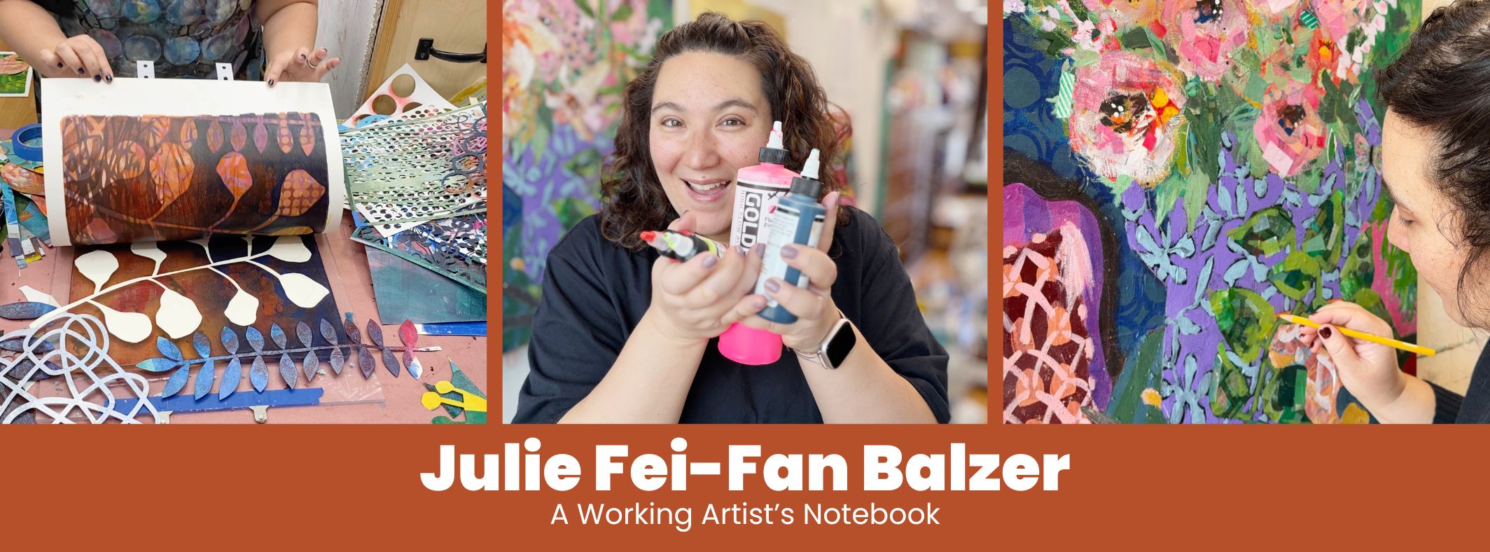
Welcome back to my “how to stencil” series during which I’m also highlighting the stencils I designed for the most recent TCW (The Crafter’s Workshop) release. Today we are playing with TCW957: Quartered Blocked.
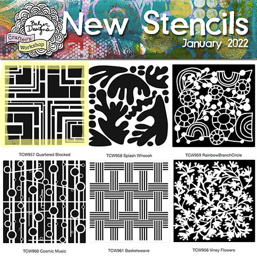
This is the stencil that I previously mentioned was based on an old door I saw. Inspiration really can come from anywhere if you keep your eyes (and your mind) open!
Fancy Ghost Prints aka Gel Plate Stencil Lift with a Transparent Paint Pull
In this short tutorial video I’m showing you how I like to create ghost prints – with a reverse of the stencil – and combine various colors of those ghost prints for a simple and beautiful greeting card! Enjoy!
This is the card that I made in the video:
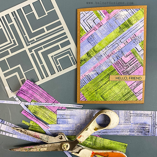
You may recall that I used a similar technique a few years ago, but with very different looking results.
The Basic Technique Explained
It’s essentially a gelatin plate stencil resist/layered pull technique.
- Brayer a very thin layer of acrylic paint onto the gelatin plate.
- Place the stencil on the plate.
- Use scrap paper to lift the exposed paint through the stencil openings.
- Remove the stencil, leaving a thin painted stencil image/residue on the plate.
- Brayer on a thin layer of transparent acrylic paint.
- Pull a print that picks up both the new color and the remaining stencil image.
The key technical point is using very little paint, so that first stencil layer is almost dry before you add the transparent layer and pull the final print.
Thoughts to Note:
Here are a few things (beyond just stenciling and gelatin printing techniques) that I hope you take away from this video:
- Use less paint than you think you need. With gelatin printing, a thin layer of paint can give you a cleaner result and makes it easier to build subsequent layers.
- Dryness matters. If the first layer is still too wet, it can smear or lift unpredictably. A very thin residue gives you much more control.
- Transparent paint is useful for pulling layered prints. It allows earlier marks and stencil imagery to remain visible instead of covering them completely.
- Repeat one design element to create unity. Using the same stencil across several different colors makes otherwise unrelated papers feel like they belong together.
- Repeat a color to strengthen that unity even more. The Payne’s gray acts almost like a visual thread running through all the pieces.
- Variation keeps repetition from becoming boring. Different colors, different strip widths, and changing directions create energy while the repeated stencil keeps everything cohesive.
- You don’t need a complicated composition plan. Sometimes you can work intuitively—placing, turning, trimming, and responding as you go—if you’ve already created enough unity in the materials.
- Subtle stenciling can be more useful than obvious stenciling. The stencil doesn’t always have to be the star. It can function as texture, rhythm, or connective tissue.
- Cutting artwork apart can make it easier to use. A print that feels awkward as a whole may become much more interesting once it’s divided into smaller pieces.
- Strips are a simple way to build rhythm. Repeated verticals, diagonals, and changing widths give the eye a path through the composition.
- Small finishing choices matter. Changing the sentiment paper from white to kraft and adding a dark edge helped it relate better to the rest of the piece.
- If something feels wrong, adjust it instead of forcing it. The first sentiment choice wasn’t working, so you changed it. That kind of small course correction is part of making art.
- One printing session can generate a lot of finished work. If you create several related papers at once, you’ve essentially built your own coordinated collage set.
- Efficiency and creativity are not opposites. A repeatable process can actually free you up to make more decisions about color, placement, direction, and composition.
The larger lesson here is: cohesion doesn’t require everything to match. You can use lots of different colors, sizes, and directions—as long as you repeat a few key elements that hold the whole thing together.
Thanks for stopping by!
Links
Stencil links if you wish to buy any of them:
- TCW956: Viney Flowers 12×12: https://shrsl.com/3clb8 6×6: http://shrsl.com/3clbe
- TCW957: Quartered Blocked 12×12: http://shrsl.com/3clbg 6×6: http://shrsl.com/3clbh
- TCW958: Splash Whoosh 12×12: http://shrsl.com/3clbj 6×6: http://shrsl.com/3clbm
- TCW959: Rainbow Branch Circle 12×12: http://shrsl.com/3clbq 6×6: http://shrsl.com/3clbu
- TCW960: Cosmic Music 12×12: http://shrsl.com/3clbw 6×6: http://shrsl.com/3clc2
- TCW961: Basketweave 12×12: http://shrsl.com/3clc5 6×6: http://shrsl.com/3clc9
Other posts in this how-to stencil blog series:
- Six New Stencil Designs from Balzer Designs: Unboxing Video
- How to Stencil: Stenciling with Ink Pads on the Gelatin Plate!
- How to Stencil: Some Tips on Using a Stencil Brush
- How to Stencil: Making Ghost Prints with Stencils on a Gel Plate (this post)
- How to Stencil: Stamping Through a Stencil
- How to Use Spray Ink with Stencils: Get Two Prints from One Spray
- How to Stencil: Stamping with a Stencil

Oooh, love this!
Julie- what do you use to glue the pieces down? It looks like a
tape dispenser. What a cute idea the card is. Thanks, Pat
Fabulous! Thank you for sharing this!
It is a big tape dispenser: https://amzn.to/3heMAhH
Thanks!
You’re welcome!