Welcome back to my “how to stencil” series during which I’m also highlighting the stencils I designed for the most recent TCW (The Crafter’s Workshop) release. Today we are playing with TCW958: Splash Whoosh.
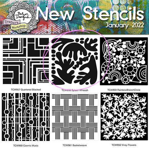
This stencil has a very Matisse Cut-Outs feeling, don’t you think?
Mixed Media Art Technique: Stamping Through a Stencil
Have you ever tried stamping through a stencil? It’s lots of fun and if you use pigment ink, there’s a bonus way of coloring in your image. I took the paper I stamped and turned it into a simple and beautiful greeting card, which I’m sharing in this video! Take a peek:
This is the card that I made in the video:
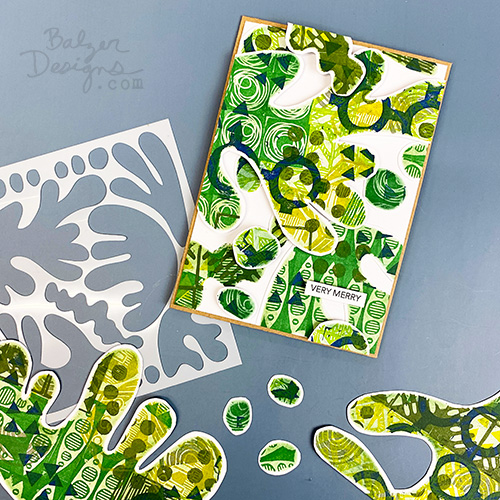
I enjoy making holiday cards that aren’t quite the expected motifs.
Take Aways for You
Here are some art-related insights that I hope you take away from this tutorial:
- A stencil can be more than a tool for applying paint. You can use it as a boundary, a frame, or a container for stamping, drawing, doodling, and layering.
- Work with what you have. The exact ink or stamp type is less important than understanding the process. Pigment ink, archival ink, Distress Ink, paint, rubber stamps, foam stamps, and hand-carved stamps can all work.
- Layering creates richness. Repeating different patterns through the same stencil opening builds complexity while the stencil shape keeps everything visually contained.
- If a color palette feels flat, add contrast without abandoning the palette. Introducing blue into a green-and-yellow scheme added more energy while still keeping the colors related.
- Mess can become part of the technique. Ink collecting on the stencil isn’t necessarily a problem. In this case, wiping that ink back into the openings helped soften and unify the stamped marks.
- A unifying layer can rescue uneven areas. Blending residual ink into the stencil openings helps connect disparate marks and makes missed spots less obvious.
- You don’t need perfect coverage. The process is forgiving because the later blending step integrates irregular stamping into the overall design.
- White space can be structural. Leaving a white border around the cut shapes keeps them visually separate and prevents the collage from becoming chaotic.
- Negative space helps busy elements breathe. When the patterned pieces are dense, the white borders give the eye somewhere to rest.
- Dimension can clarify a composition. Raising some pieces with foam adhesive creates hierarchy and separation between overlapping shapes.
- Cutting apart a piece you love can create something stronger. A successful surface doesn’t always need to remain intact. Fragmenting it can open up new compositional possibilities.
- Composition can be intuitive. You don’t always need to plan placement in advance. Moving pieces around and responding to how they relate can be a legitimate design process.
- Repetition plus variation is a powerful combination. The repeated stencil shape creates cohesion, while differences in pattern, color, placement, and height keep the result interesting.
The larger lesson is that busy artwork often needs structure, not less information. Repeated shapes, a controlled palette, white space, and changes in dimension can organize a lot of visual complexity without taking away its energy.
Links
Stencil links if you wish to buy any of them:
- TCW956: Viney Flowers 12×12: https://shrsl.com/3clb8 6×6: http://shrsl.com/3clbe
- TCW957: Quartered Blocked 12×12: http://shrsl.com/3clbg 6×6: http://shrsl.com/3clbh
- TCW958: Splash Whoosh 12×12: http://shrsl.com/3clbj 6×6: http://shrsl.com/3clbm
- TCW959: Rainbow Branch Circle 12×12: http://shrsl.com/3clbq 6×6: http://shrsl.com/3clbu
- TCW960: Cosmic Music 12×12: http://shrsl.com/3clbw 6×6: http://shrsl.com/3clc2
- TCW961: Basketweave 12×12: http://shrsl.com/3clc5 6×6: http://shrsl.com/3clc9
Other posts in this how-to stencil blog series:
- Six New Stencil Designs from Balzer Designs: Unboxing Video
- How to Stencil: Stenciling with Ink Pads on the Gelatin Plate!
- How to Stencil: Some Tips on Using a Stencil Brush
- How to Stencil: Making Ghost Prints with Stencils on a Gel Plate
- How to Stencil: Stamping Through a Stencil (this post)
- How to Use Spray Ink with Stencils: Get Two Prints from One Spray
- How to Stencil: Stamping with a Stencil

This is a brilliant idea for making fabric designs. Thanks so much!
Have fun!
This is a great idea. You are so creative!
Thank you!