Color contrast is one of those quiet power tools in your art practice. It’s what makes things pop, recede, and feel alive. At its most basic, it’s the difference between light and dark, warm and cool, or even complementary colors placed next to each other. But what it does is much more interesting: it creates emphasis, guides the viewer’s eye, and builds visual energy. High contrast can feel bold and dramatic, while low contrast can feel soft and subtle. When you understand how to control contrast, you’re not just choosing colors, you’re deciding what matters most in your piece and how someone experiences it. Personally, I will always love HIGH contrast!
Breaking the Rules
I love reading the articles on design in scrapbooking magazine. I still have burned into my brain the advice to match the color of the clothing in the photograph to the color of your background paper. This advice, however, comes from a time when we also believed that if one person was wearing blue and the other person was wearing red, you had to make the photo black-and-white because the red and the blue clashed too much in your photo.
Times certainly have changed, haven’t they?
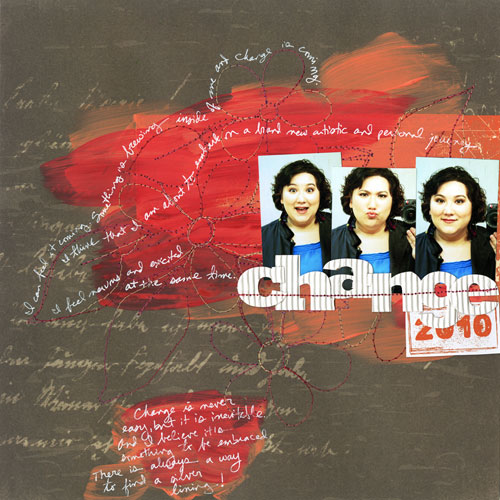
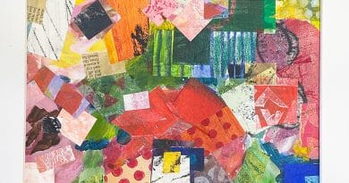
I’m always delighted to break the rules and have a little bit of fun. But I do think being aware of the rules is important. Otherwise I never would have thought that brown, orange, blue, red, and white could look so good together:
Here are the rest of the page details:
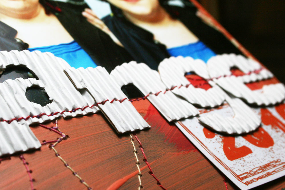
As a side note, I didn’t have an “n” or a “g” so I used an upside down “u” and a “9” to create the title. I don’t think you can even tell!
Why It Works
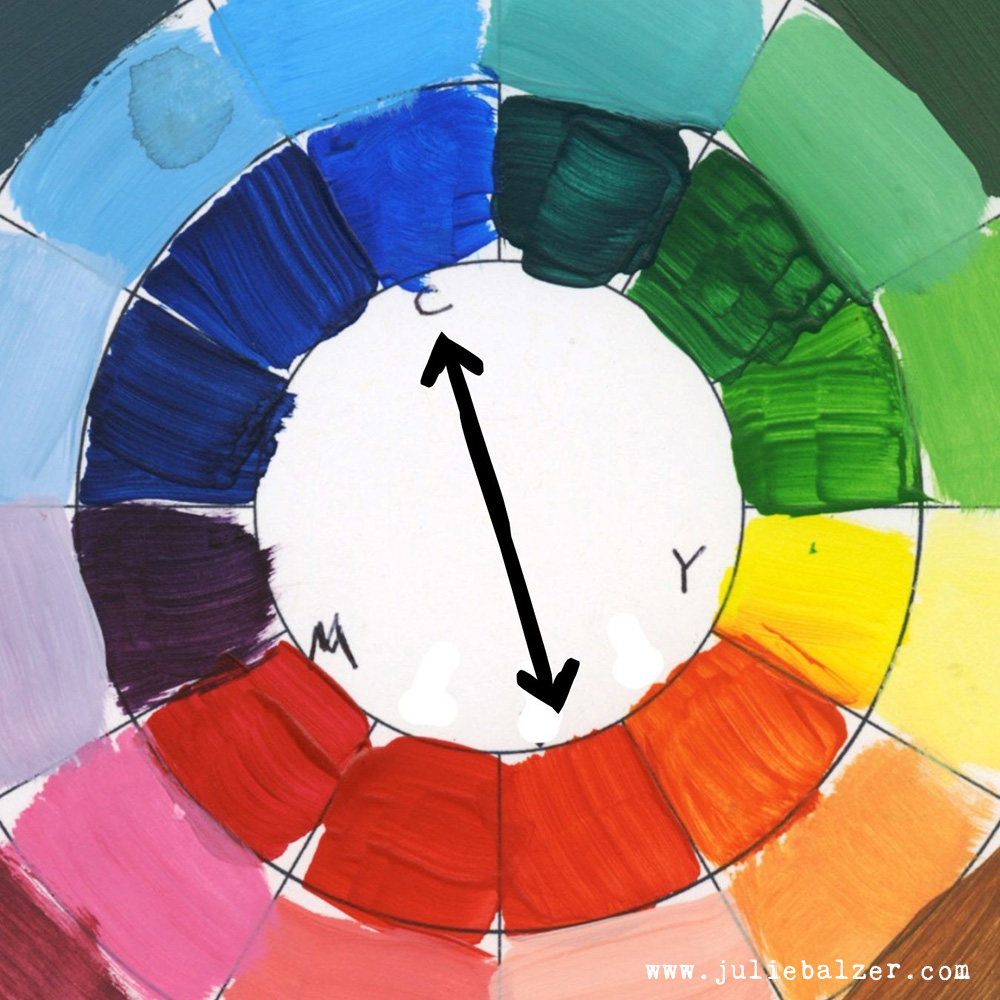
It’s a combination of color and value contrast that makes it work. The blue in the photos is popped forward by the strong contrast with the orange and red paint. (Blue is opposite orange on the color wheel.)
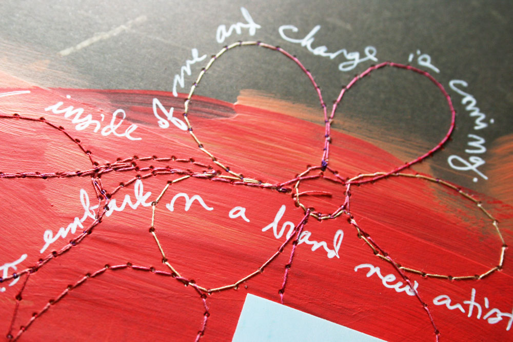
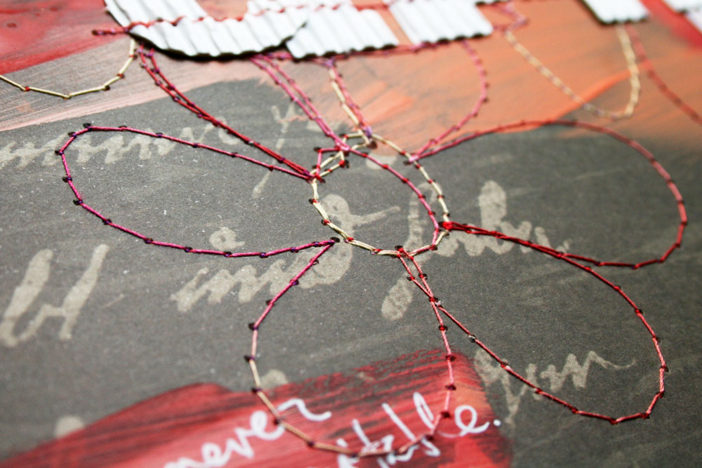
The white (photo backgrounds, title, date, and journaling) is also in high contrast to the dark brown background, as well as the red and orange. The combination of the high contrast and having grouped all the white items (other than the journaling) together creates a strong and identifiable focal point.
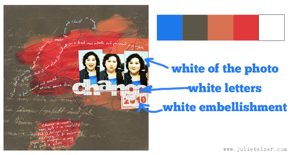
Finally, because the focal point is dominated by white, the miscellaneous strands of journaling feel very much a part of the page, rather than miscellaneous floating pieces.
How to Get Better at Design (and Color)
My explainer may seem really complicated to you or it may seem like second nature. If you’re not a person who instinctively gets design, take a class (I have several on design and color), buy a book, scour the web, and practice. Once you’ve got the rules down, it all become instinct and you can start creating good design unconsciously. It’s like learning to read. At first you have to sound out every word. After a while you simply recognize words, and finally it becomes second nature.
Thanks for stopping by!
P.S. Answers to two questions from yesterday’s post on Fabric Artist Trading Cards (ATC) that I thought might be of interest to several people:
Q: How do you sticth a pattern so perfect? Lots of patience? I recently found the “reverse” button on my machine (shame on me, lol), and maybe it will make things easier, but your stitches are so perfect! – Carla
A: Thanks, Carla! A few tips: (1) yes, practice does make perfect; (2) my stitches are not actually perfect and when you’re okay with that it really helps; (3) go fast – so many people stitch slowly trying to be perfect, but I’ve found that free motion stitching is easier when you just put the pedal to the floor and get going!
Q: What kind of foot did you use on your sewing machine when you were stitching those flowers? – Marta
A: I use a free motion foot, sometimes called a darning foot. And I put my feed dogs down so that I can manipulate the fabric in any way that I want.


It’s lovely to learn the principles of design and how we can incorporate in our work…so things sort of make sense!
I enjoyed looking at this LO Julie and reading the design details behind it. I don’t typically think that way, but see it so clearly when you describe it.
Love your layout! Love the flower, and the paint!!
Love the color contrast! It really makes your adorable photos pop!
Love that layout – it really pops! Great colors and fun design!
Excellent post Julie – you make design seem so simple!
Love your haircut, meant to post that last week but somehow did not get to it 🙂
Thanks for all the tips. Love the “floaty” journaling.
Pingback: Why the Structure of Artwork Matters - Balzer Designs Blog