You may recall that back in September I shared a photo of a new improv quilt top in progress.
Well, I’ve been working on it in fits and spurts. And I’ve been using the black and white filter on my phone’s camera to make some design choices.
Using Value to Make Design Decisions on My Improv Quilt
I think that people mistake the word “improv” (short for improvisation) to mean that you’re just doing whatever you want without a lot of thought.
Incorrect!
As Viola Spolin once said, “Improvisation is the moment when planning and opportunity meet.” You riff within a framework using your practiced skills, much like a jazz musician might. For this improv quilt, I used value as framework.
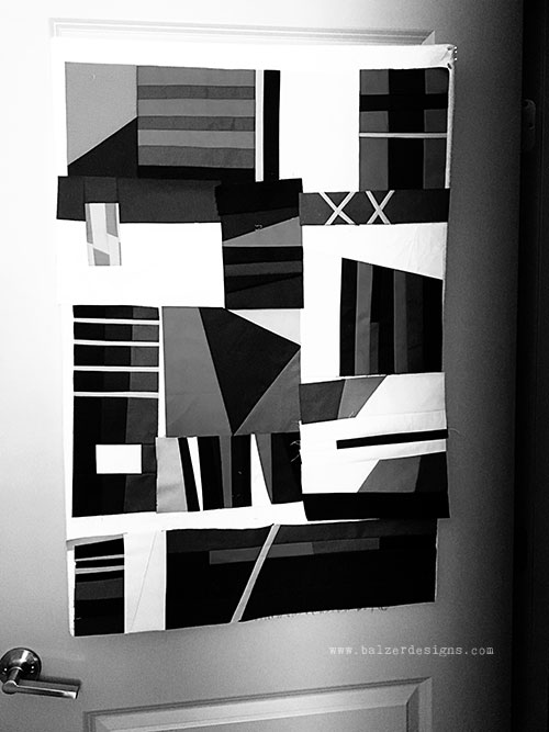
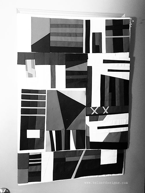
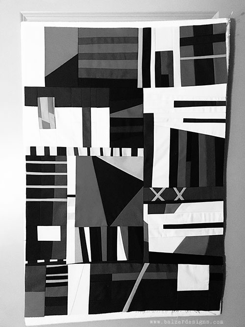
Value is a scale from white to black of lightness and darkness. The black and white filter on my phone’s camera makes it super easy to see. But, you don’t have to believe me. Scroll down to see it in action.
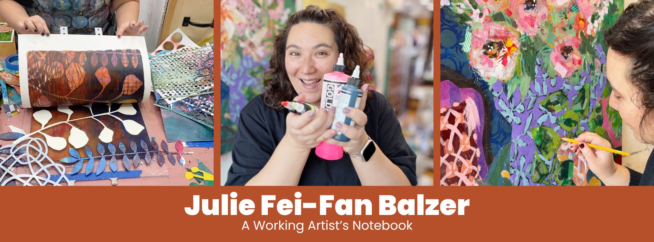
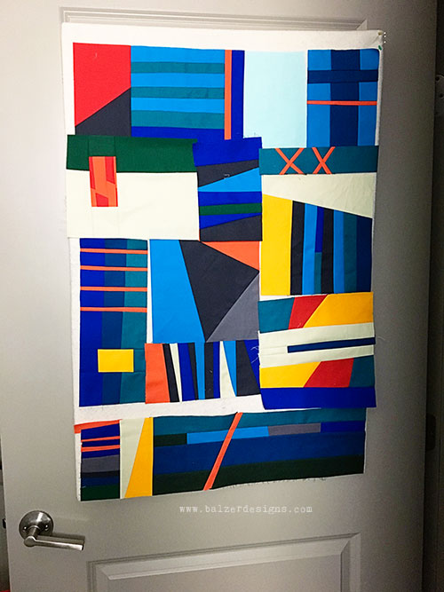
Improv Quilt Progress
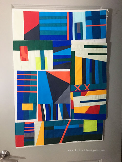
The differences are subtle, so pay attention. Here is where I began checking value:
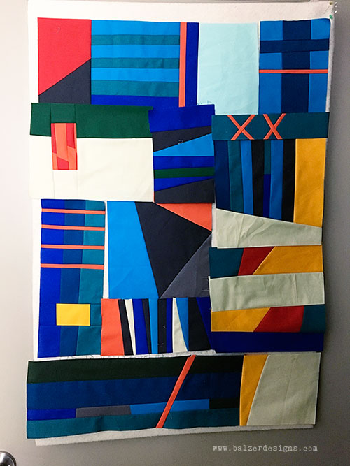
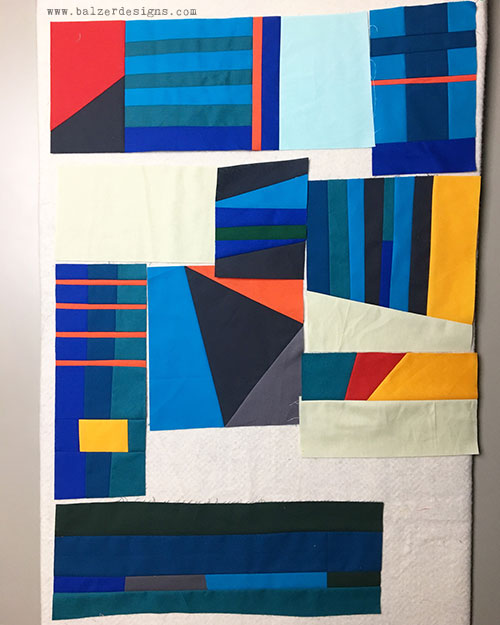
The light shapes are not dynamic enough for me in the image above. So, I made some adjustments to those light areas:
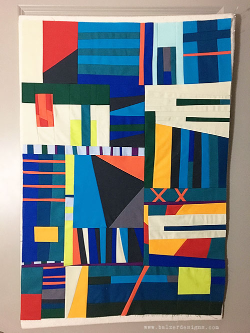
It’s better, but I feel like I need more details. Some of the light shapes strike me as being boring. So, I made some adjustments to add more detail and make them more dynamic and detailed:
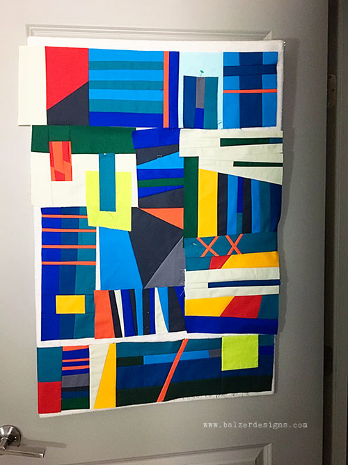
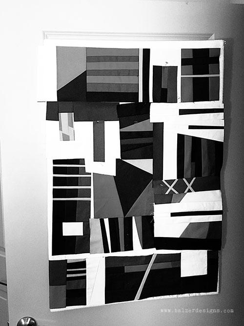
I like this now, but some of it is really tough sewing. Thinking practically, maybe I need to simplify some of the overlapping areas? And so I did:
Feels good! I made some small fixes to balance (another art fundamental, like value) and then sewed it all together:
I’m pretty happy with the state of things. I’m going to marinate on this and if I still feel good about it, I’ll quilt it!
Final Thought
Have you tried the black and white trick to help “see” the design a bit better? It’s one of the reasons that Notan – the Japanese concept of balanced light and dark – is an important artistic building block!
The more I make art, the more I realize how helpful art fundamentals are. They can be less exciting to study than embellishment techniques, but they do a lot of the heavy lifting in terms of making projects look good. I think of art fundamentals like foundation garments. Not particularly attractive, but they make all the pretty garments look better!
Thanks for stopping by!

sometimes I check color photos in black and white before getting them printed.